Sports World App
UX & UI
Project Description
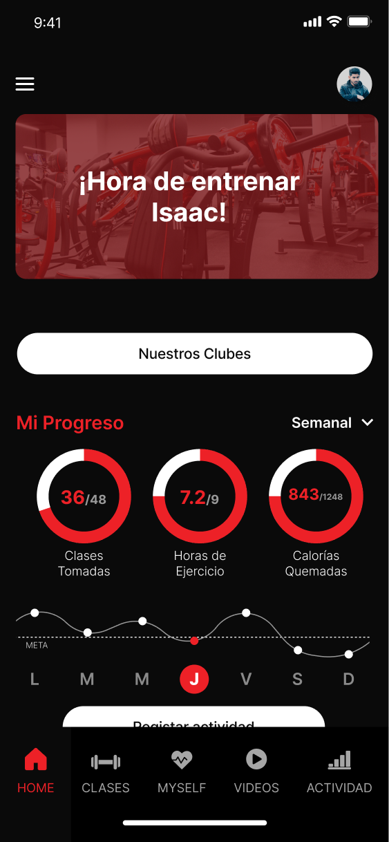
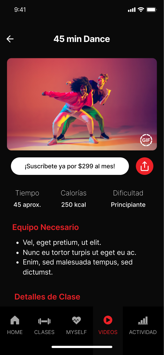
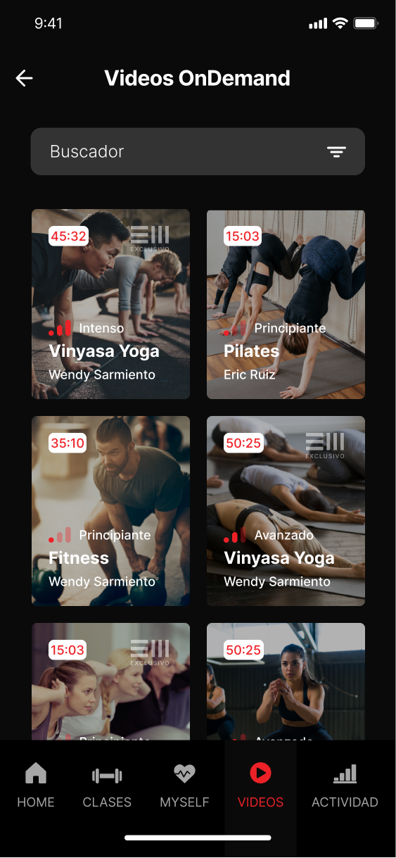
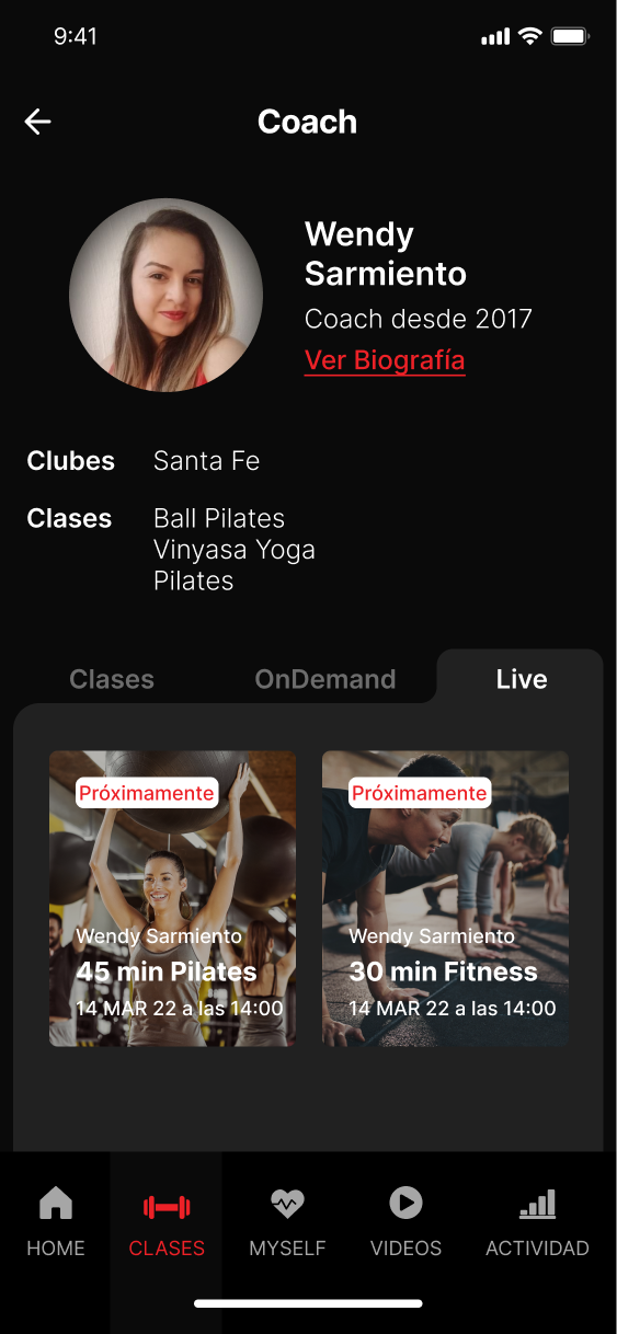
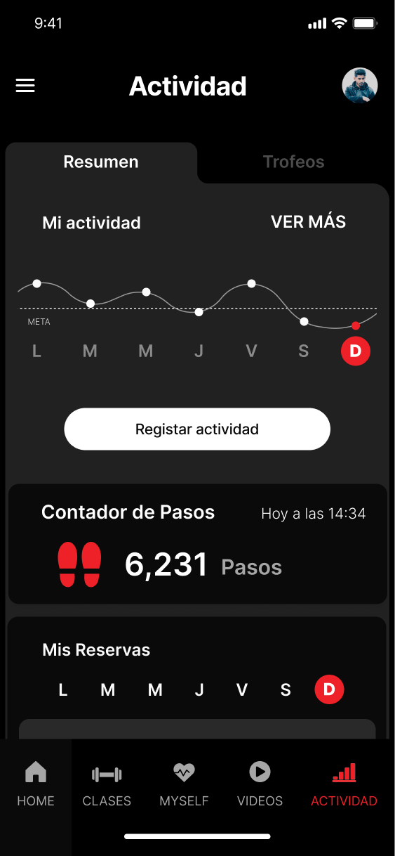
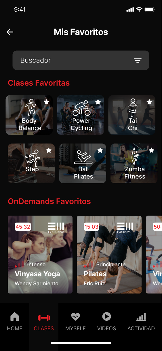
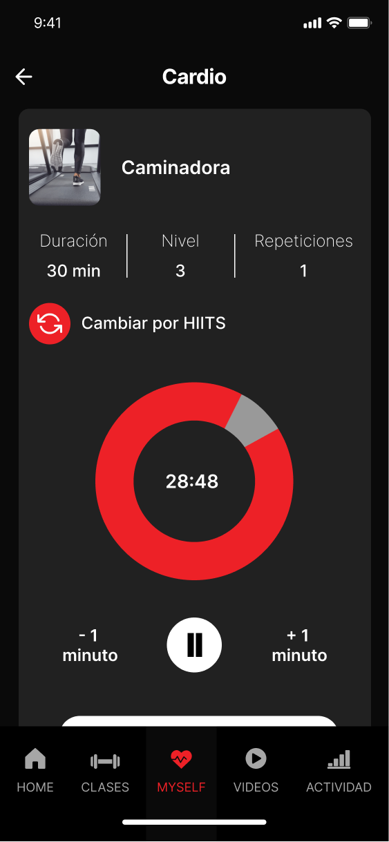
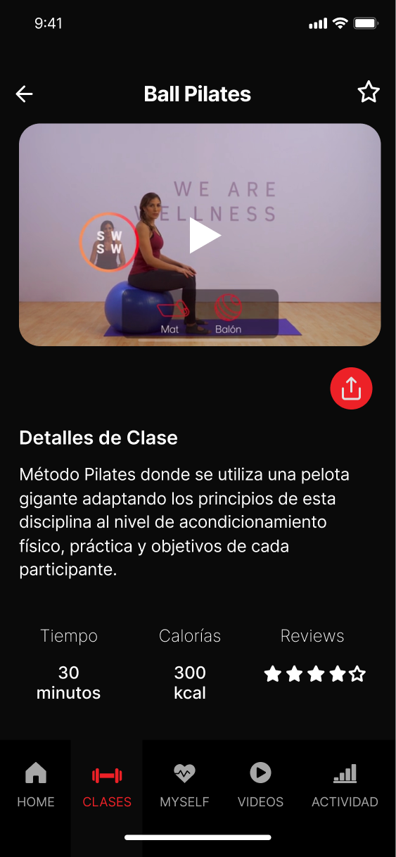
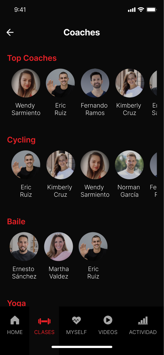
For this project, I had the opportunity to design the user experience and user interface of the Sports World gym app. My role encompassed the entire design process, from information architecture to wireframes, visual design, and prototyping.
One of the main challenges was to create a seamless and intuitive user experience that would guide users through the app’s main features, such as finding and booking classes, tracking their workout progress, and connecting with other gym members.
To achieve this, I first worked on defining the app’s information architecture and navigation, ensuring that the content was organized in a logical and easy-to-understand way. Then, I created wireframes and prototypes to test and refine the user flow and interactions.
Next, I worked on the visual design, using Sports World’s brand guidelines and color palette to create a modern and energetic look and feel that would appeal to the gym’s target audience. Finally, I developed a high-fidelity prototype that showcased the app’s main features and interactions.
Overall, I’m proud of the outcome of this project, as it represents a user-centered and visually appealing solution that meets Sports World’s business goals and enhances the gym experience for its members
*Project in collaboration with Redbox innovation.
Sports World App
UX & UI
Descripción del proyecto
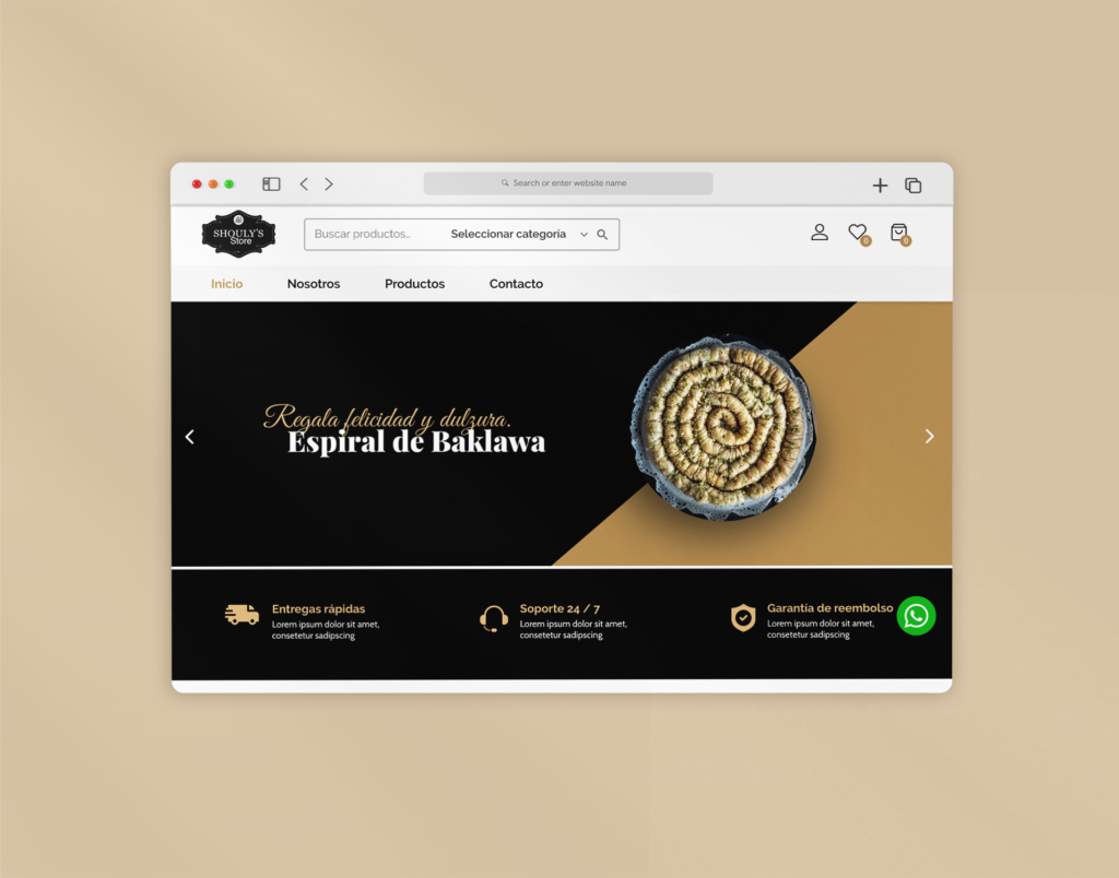
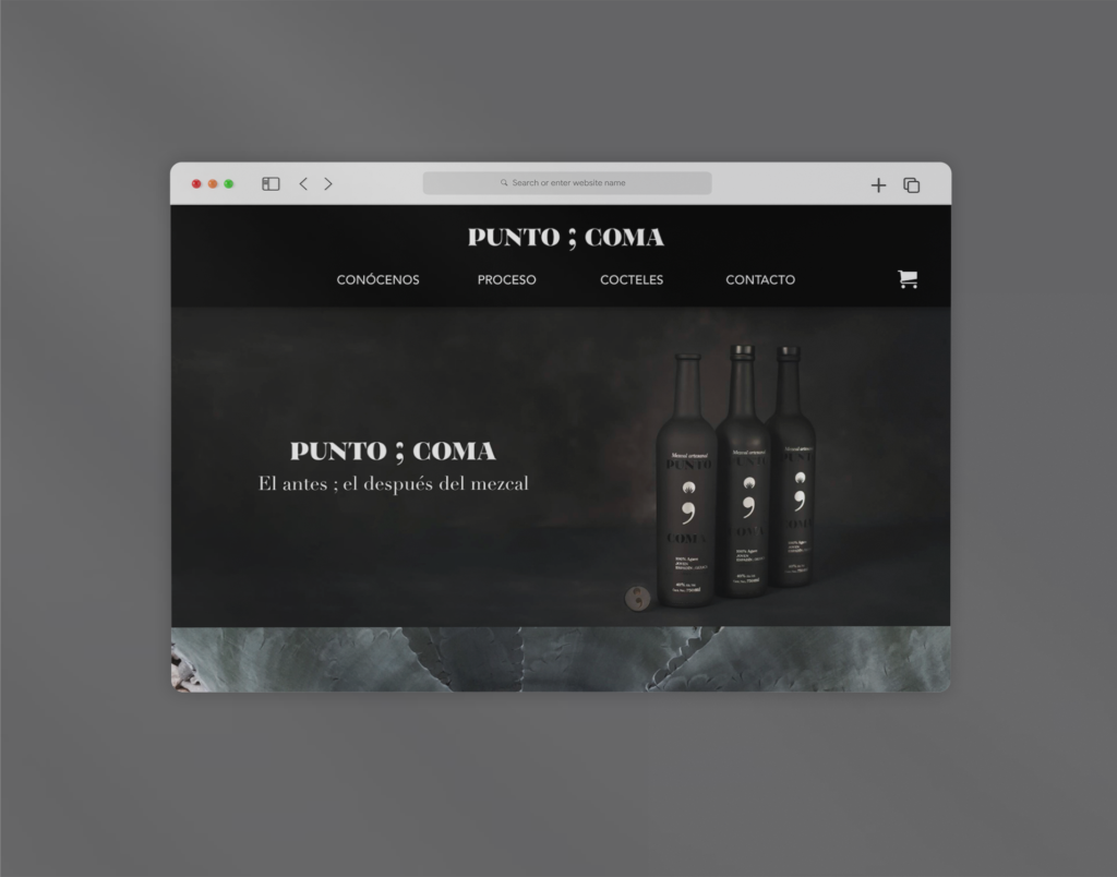
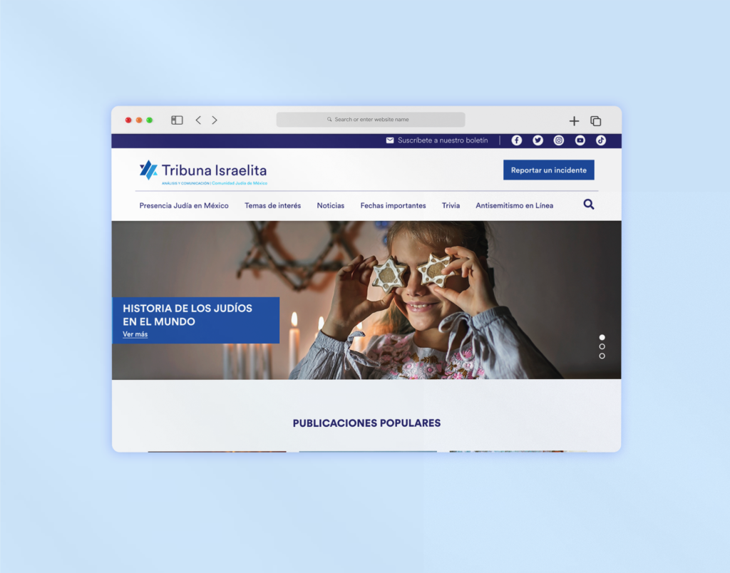
Para este proyecto se realizó el diseño del sitio web de SIP Inventarios, una empresa enfocada al servicio de inventarios y auditorías. El objetivo de este proyecto era poder mostrar el catálogo de los servicios que ofrecía la empresa así como destacar sus ventajas y diferenciadores.
Proceso
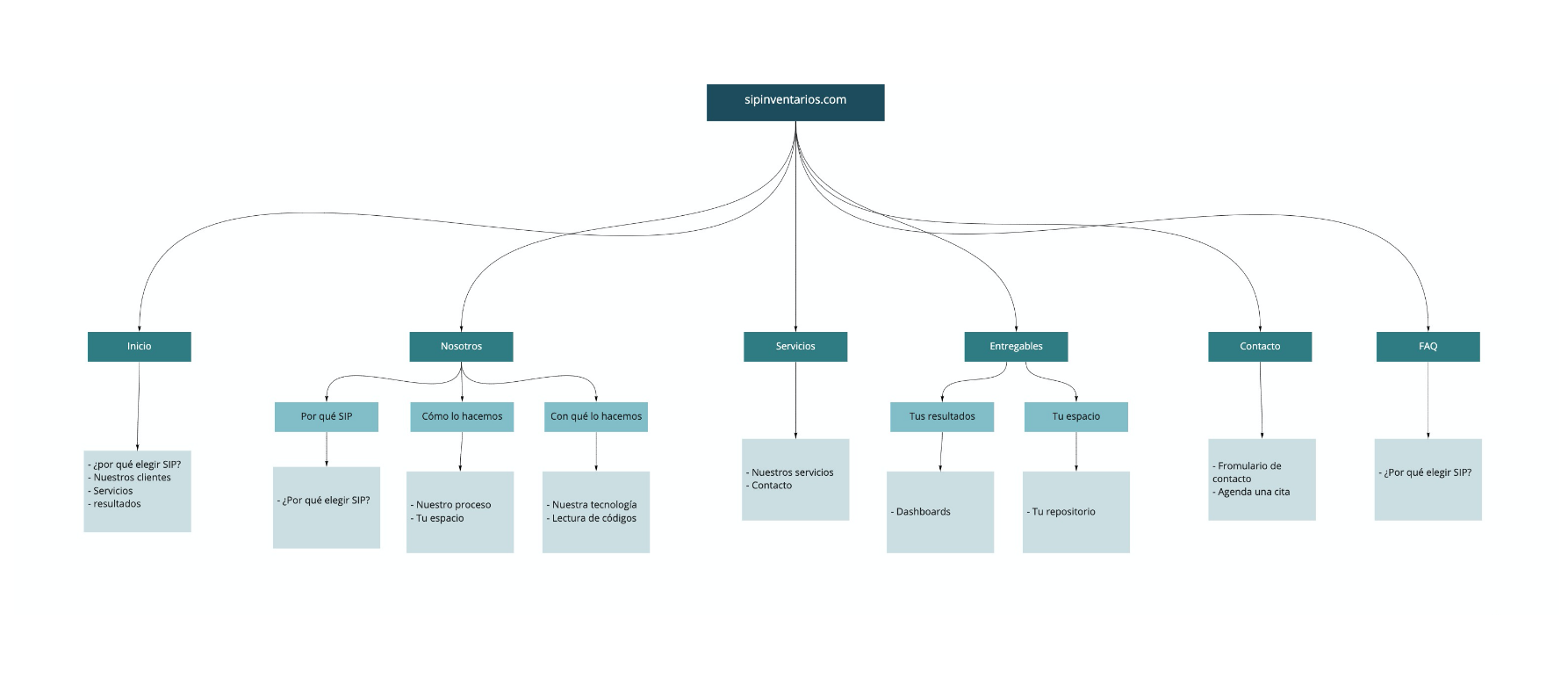
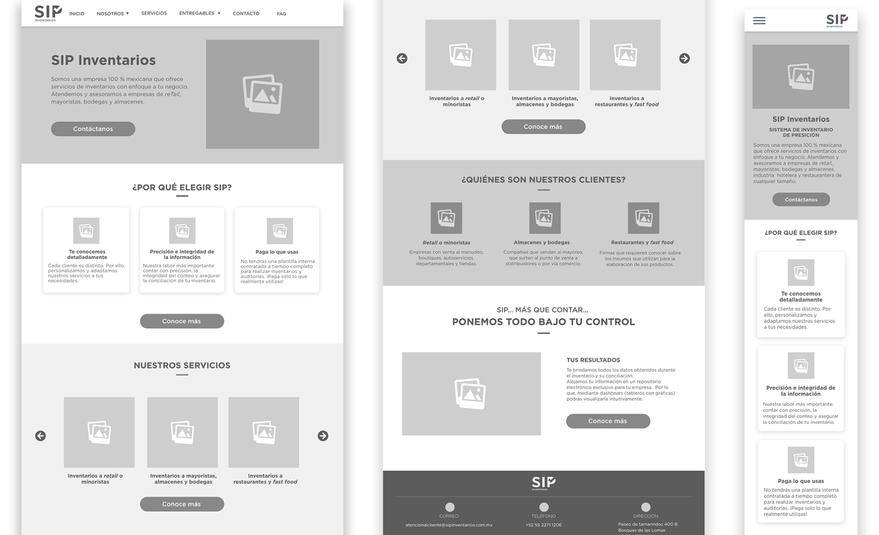
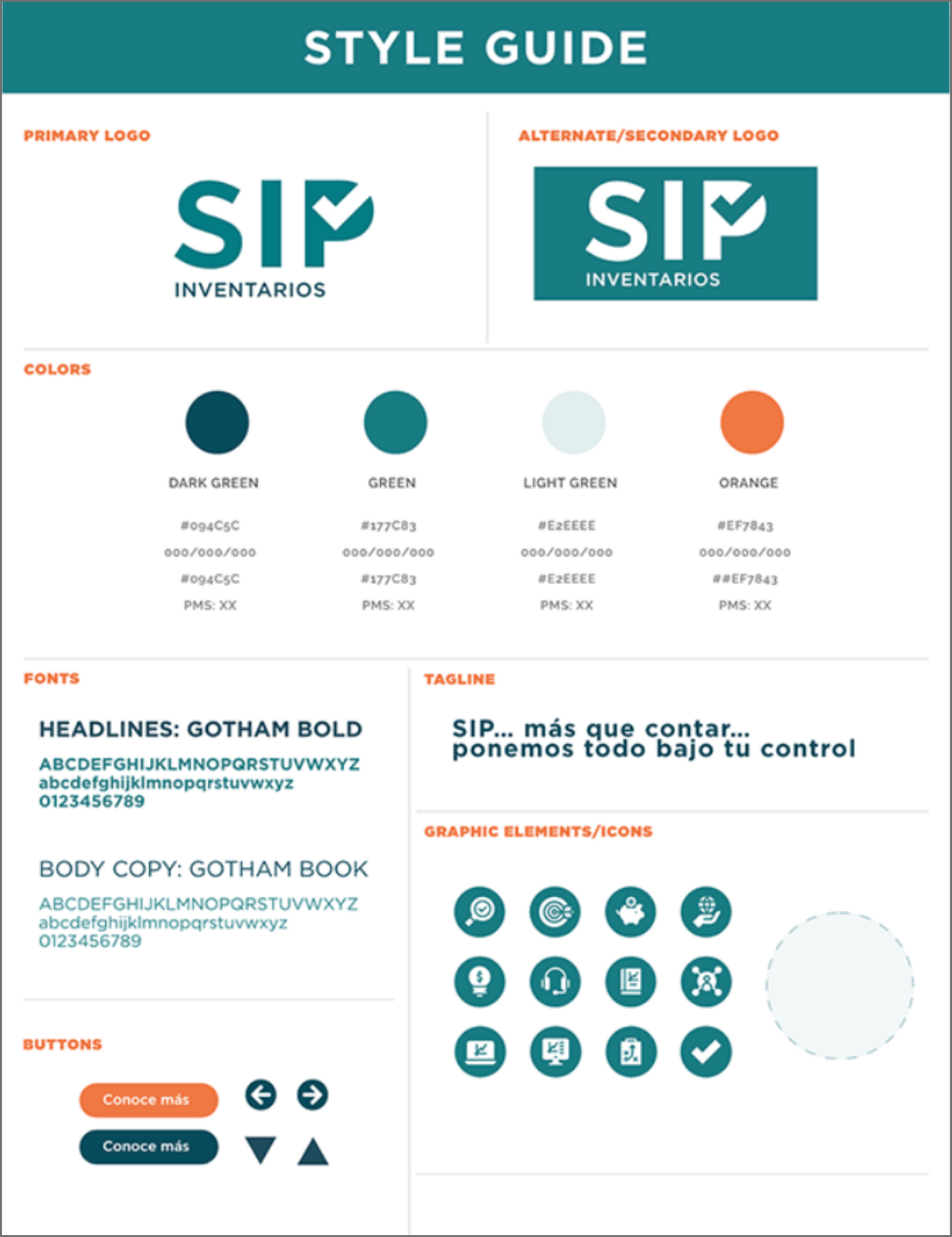
*Proyecto en colaboración con YGU Comunicaxión.
Final result
